As we welcome 2025, the digital landscape is rapidly evolving, bringing fresh and exciting trends to web design. At Tukan Agency, we’re always on the lookout for the latest innovations to keep our clients’ websites engaging and competitive.
Example:
Netflix adapts its recommendation based on what you watched and liked so to your taste.
Example:
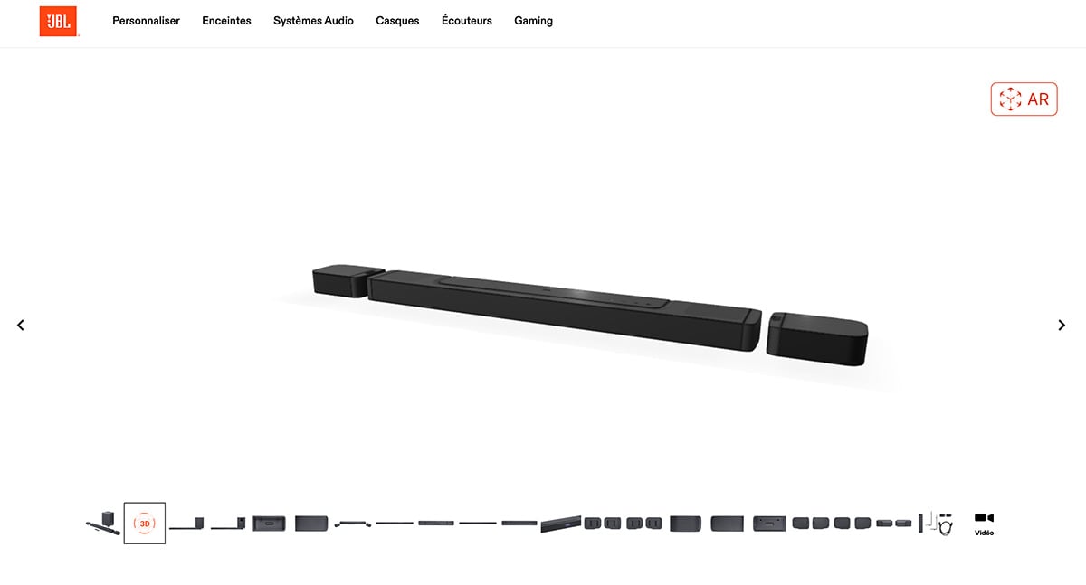
JBL decided to showcase their new soundbars using AR so prospects can better visualise the new speaker in their own place. Using the link below, just choose 3D at the bottom of the image then click on AR on the top right to be able to see the soundbar in your own living room.
Example:
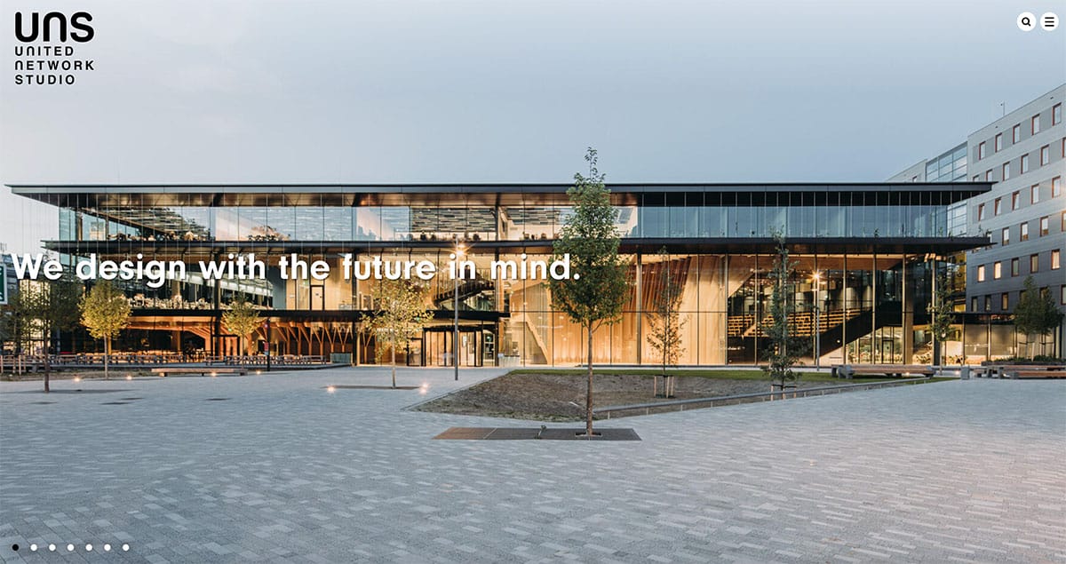
United Network Studio website is future focused with ample space to showcase their creations and added few special effects to add to the atmosphere.
Example:
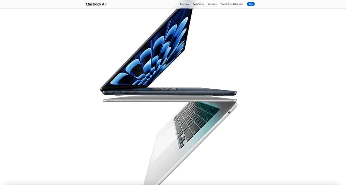
Apple Apple was an early adopter of using whitespace on the web to showcase its products.
Apple nails the use of active whitespace on their website by strategically placing imagery to catch your eye and lead you down the page. But they don’t stop there – passive whitespace also plays its part, smoothly guiding you through the content without any bumps along the way.
Example:
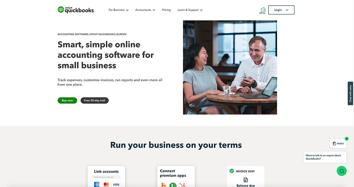
QuickBooks. Navigating QuickBooks is a total breeze. The interface is super user-friendly, so you can find everything you need without a hitch. The dashboard gives you a crystal-clear overview of all the key features, making it easy to manage your finances without getting overwhelmed.
Example:
Design Studio UI UX. Instead of one example, we chose to show you several examples of micro-interactions so you have a better overview of what they are and how to they can be impactful.
Example:
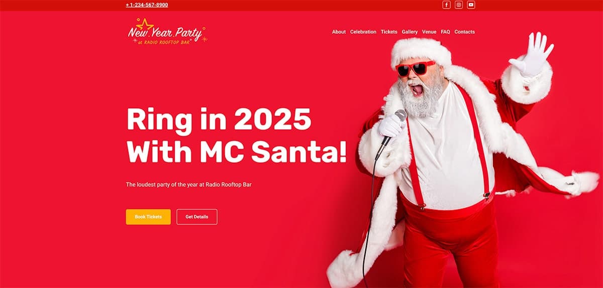
NY party template website. This lively website template is all about the New Year party vibes.Using Santa’s red combined with a bright and cheerful design, clear and concise text, and fantastic photos of the professionals, you can’t miss the playful part!
Example:
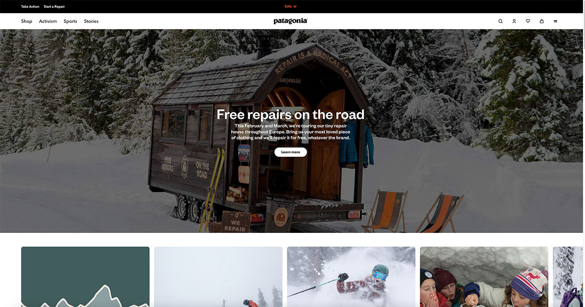
Patagonia, the famed outdoor apparel brand, nails the minimalist design game, putting content front and center instead of drowning you in flashy graphics. Thanks to savvy image optimization and fewer HTTP requests, their website not only offers a seamless user experience but also shrinks its environmental footprint. Pretty cool, right?
Examples:
Digital Marketing Institute. Here are a few examples using AI to improve user experience (UX) in web projects:
Example:
JustInMind. This blog post lists 40 great examples of using Hero areas very effectively (imagery, text, placement, gradients, video, typography, texture, etc).
Here are the top 10 website design trends you should watch for in 2025:
1. AI-Driven Personalization
AI is shaking things up in website interactions. By crunching user data in real-time, websites can offer tailored content, product recommendations, and layouts that feel personal. Imagine an e-commerce site that adjusts product categories based on your browsing history. This isn’t just cool; it’s a game-changer for user experience and engagement, making users feel seen and understood.Example:
Netflix adapts its recommendation based on what you watched and liked so to your taste.

2. Augmented Reality (AR) Integration
AR is becoming a web design superstar, bringing immersive experiences directly to your browser. Think virtual try-ons for retail websites—see how those shoes look without leaving your couch. It’s not just about fun; it reduces online shopping doubts and boosts confidence in purchases. And it’s not just retail—real estate and education sectors are also jumping on the AR bandwagon.Example:
JBL decided to showcase their new soundbars using AR so prospects can better visualise the new speaker in their own place. Using the link below, just choose 3D at the bottom of the image then click on AR on the top right to be able to see the soundbar in your own living room.
3. Minimalism and Clarity
Minimalism isn’t just a trend; it’s a movement. Focus on the essentials, cut the clutter. This approach makes navigation a breeze, especially on mobile devices. Clean lines, ample white space, and straightforward navigation mean a smoother, more enjoyable user experience. Plus, it helps with faster load times and better performance across devices. Win-win!Example:
United Network Studio website is future focused with ample space to showcase their creations and added few special effects to add to the atmosphere.
4. Negative Space
Negative space, or white space, is your design’s best friend. It highlights key content and guides the user’s eye, making everything more readable and accessible. And who said negative space has to be white? Use any contrasting color to create a balanced, visually appealing layout. It’s all about making it easier for users to find what they need without feeling overwhelmed.Example:
Apple Apple was an early adopter of using whitespace on the web to showcase its products.
Apple nails the use of active whitespace on their website by strategically placing imagery to catch your eye and lead you down the page. But they don’t stop there – passive whitespace also plays its part, smoothly guiding you through the content without any bumps along the way.
5. Streamlined User Experience
User experience is everything. Streamlining interactions and refining website processes are crucial for keeping users happy. This trend is all about reducing the steps users need to take to achieve their goals, whether that’s making a purchase or finding information. Prioritizing user experience means happier visitors who stick around longer and come back for more.Example:
QuickBooks. Navigating QuickBooks is a total breeze. The interface is super user-friendly, so you can find everything you need without a hitch. The dashboard gives you a crystal-clear overview of all the key features, making it easy to manage your finances without getting overwhelmed.
6. Dynamic Cursors and Microinteractions
Dynamic cursors and microinteractions add a splash of fun to user interactions. Small animations can guide users and provide instant feedback. A cursor that changes shape when hovering over elements, or a button that animates when clicked, makes the whole experience more intuitive and enjoyable. It’s the little things that count!Example:
Design Studio UI UX. Instead of one example, we chose to show you several examples of micro-interactions so you have a better overview of what they are and how to they can be impactful.
7. Playful and Entertaining Websites
Websites are getting more playful and entertaining, using whimsical elements and unexpected stories to capture visitors’ attention. Think bright colors, fun animations, and interactive storytelling. These elements create memorable experiences that make users smile and encourage them to stick around. It’s all about standing out and leaving a lasting impression.Example:
NY party template website. This lively website template is all about the New Year party vibes.Using Santa’s red combined with a bright and cheerful design, clear and concise text, and fantastic photos of the professionals, you can’t miss the playful part!
8. Ethical, Sustainable, and Accessible Design
Designing with ethics, sustainability, and accessibility in mind is gaining traction. Making websites more inclusive ensures everyone can enjoy them. This includes using alternative text for images, high-contrast color schemes, and screen reader compatibility. Sustainable design practices, like optimizing images and reducing server load, also contribute to a greener internet. It’s the responsible way to design.Example:
Patagonia, the famed outdoor apparel brand, nails the minimalist design game, putting content front and center instead of drowning you in flashy graphics. Thanks to savvy image optimization and fewer HTTP requests, their website not only offers a seamless user experience but also shrinks its environmental footprint. Pretty cool, right?
9. AI-Powered Web Projects
AI is speeding up web design and enhancing user experience. AI chatbots and personalized marketing strategies are becoming the norm, handling routine tasks like answering customer queries. This frees up human staff to focus on more complex issues. AI also analyzes user behavior to optimize website performance, making web projects more efficient and effective.Examples:
Digital Marketing Institute. Here are a few examples using AI to improve user experience (UX) in web projects:
10. Complex and Awe-Inspiring Hero Areas
Hero areas with stunning abstract illustrations and well-placed call-to-action buttons are creating quite a buzz. These areas grab attention and guide users toward desired actions. A well-designed hero section sets the tone for the entire website, creating a powerful first impression. Combining eye-catching visuals with clear messaging, hero areas effectively communicate the website’s value proposition and encourage exploration.Example:
JustInMind. This blog post lists 40 great examples of using Hero areas very effectively (imagery, text, placement, gradients, video, typography, texture, etc).

